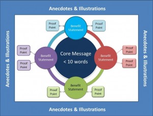
 A colleague recently mentioned she was creating a message map for her change management client. I’m a big believer in message mapping, but generally find that clients need to be educated about its value. Communications and marketing professionals are used to message mapping, but it’s a tool that can be valuable in many disciplines and especially in change management.
Message maps are a more visual and flexible way to tell your organization’s story, rather than a linear approach with talking points. If done well, you have message points told succinctly and coherently in a diagram on one page to keep everyone on script. Its flexibility allows the speaker or deliverer of the message to start the story from any point and connect the dots so the story can be tailored to the purpose and audience.
Always at the center is your core message – no more than 10 words billboard style. Jutting from the core message are benefits—again 10 or less words for each. Each benefit statement has proof points containing facts to back it up. The next level can contain anecdotes and illustrations.
The message map shouldn’t be created in a vacuum. The right people with the needed information should be included in the initial discussion and planning. This may take a long time to get everyone on the same page, so don’t expect a draft to come together quickly. In fact, an outside facilitator may help the process.
If empowering and vetting aren’t done throughout and up to the top of the organization, the final version won’t be used routinely and consistently. Understand any resistance to its use and find ways to mitigate those during the vetting process.
I’ve seen message maps laid out in many formats and go into far more detail than what is demonstrated here. Purpose, culture, project, type of organization will dictate the approach. But unless you keep it simple, you’ll lose consistency of message and its use will be limited.
